A type design tool to speed up creating letter variations
Typefaces often consist out of several fonts: a regular, bold, condensed, extended,… Those fonts are all variations on the same letterforms. For designers, it is a time-consuming process to create those variations.
It is possible to speed up this process with a program. That is what the Rhythm Influencer does. Variations on letterforms are often the result of variations in the letters' rhythm, the sequence of parallel strokes. The Rhythm Influencer derives the rhythm via the letters' highest concentration of black mass. Understanding the rhythm allows contextual scaling of the letterforms and thus speeding up creating letter variations. The automatically generated letters produced by this plugin are a solid foundation to be polished by the designer.
After installation and restarting Glyphs, the plugin is available under the menu Edit - Rhythm Influencer.
For designers, creating letter variations is a time-consuming process. Letters cannot be just stretched. Depending on the variation, it is an increase/decrease of the vertical strokes, and a different increase/decrease of the space in-between [Figure 1]. There are only a couple of guidelines after scaling: the thickest parts should be visually similar and the thinnest parts should remain visually similar. After that, curves and details need to be adjusted till they fit nicely within the whole typeface.
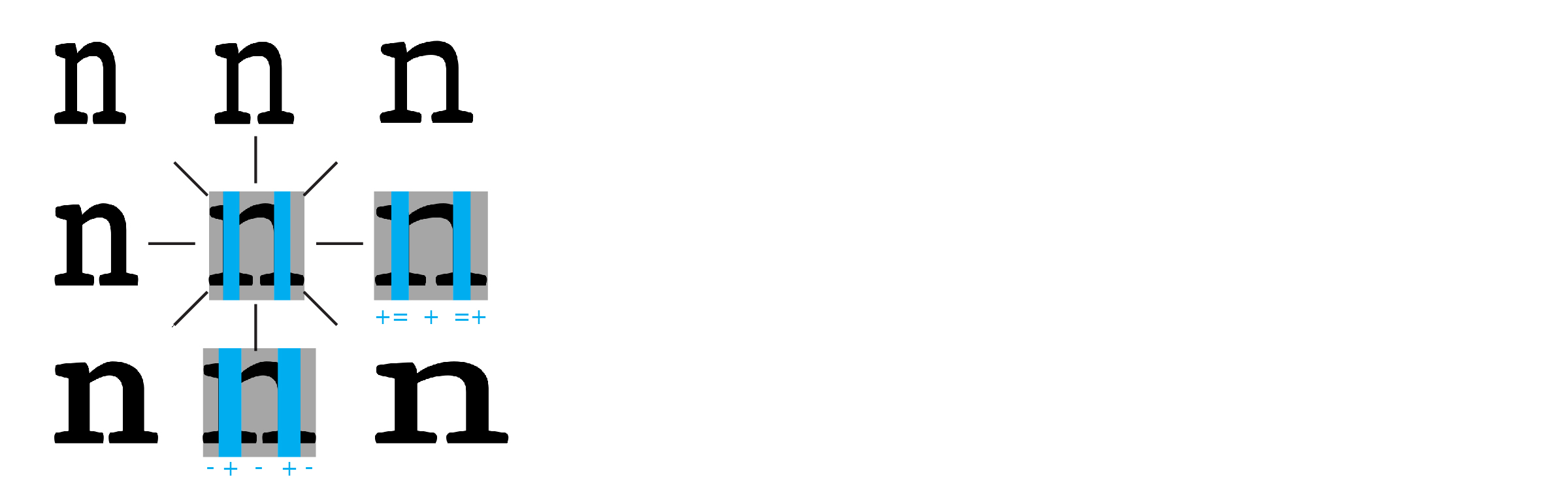
Figure 1. When creating variations on a letter, different zones are scaled diffently. These zones are further referred to as scaling zones.
Let's call the zones that are treated diffently the scaling zones. To automate the process of creating variations, I (1) introduce calculations with the mass, similar to a practice in engineering; which will allow for a positioning of (2) the rhythm within letters.
Maarten's sensitivity for the rhythm in letters originates from his background in architecture and engineering. Engineers play a game of black and white, similar to the game played by type designers [Figure 3]. The difference is that engineers do so to ensure that beams will not bend [Figure 4].
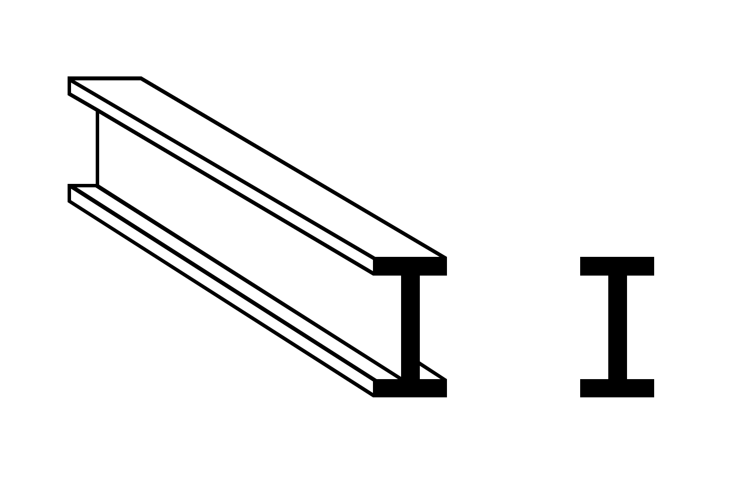
Figure 3: designing sections for a beam (left) has a lot of similarities with designing type (right).
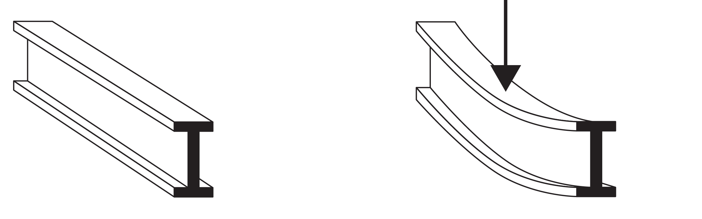
Figure 4: a beam under high presure will bend. It needs to be strong enough to resist bending.
The bending of a beam is related to its section, which often has the shape of a capital letter 'I' or 'T'. A graph next to the beam illustrates the resistance against bending. For each y-value in the section, the resistance can be derived [Figure 4].
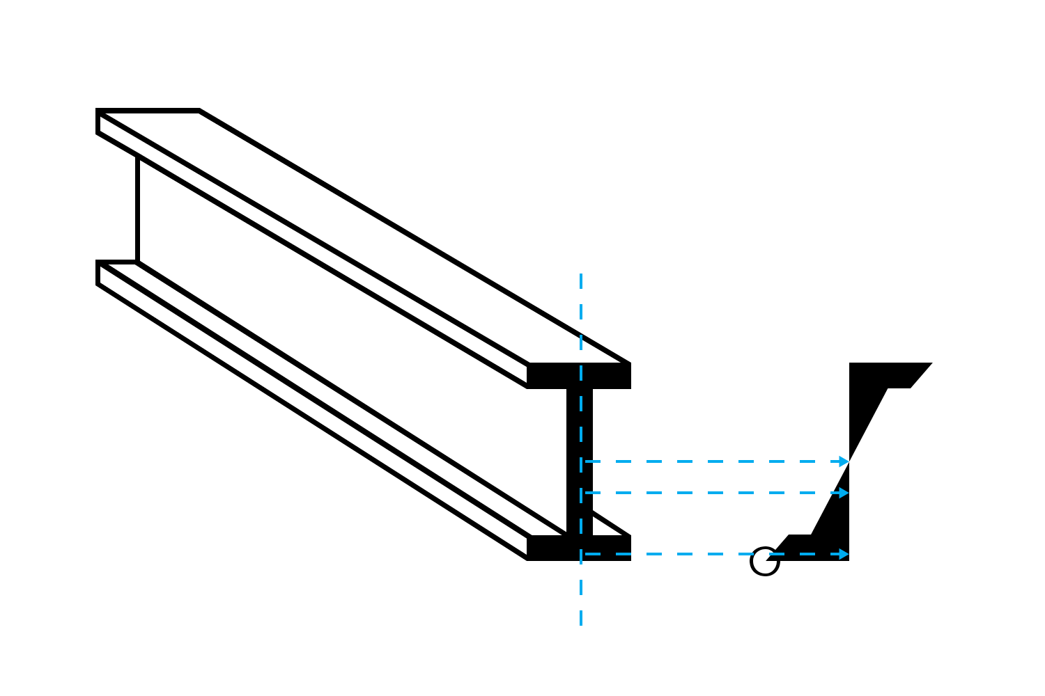
Figure 5: The mass within the section of a beam determines the beam's resistance against bending.
It is seen that the resistance closely relates to the distribution of the mass over the height of the section. Engineers adjust the mass to increase the beam's resistance against bending. They can do so by changing the vertical and horizontal elements of the beam independently. Additionally, engineers know that more white space in the section means less material costs. This way, engineers develop a sensitivity for the black/white distribution in their drawings.
From an 'I'-profile in engineering to a capital letter 'I' in type design is only a small step. Actually, there is no difference between engineers and designers in this regard, as both create shapes. Only the interpretation of what a serifs is, could be different. Historically, a capital 'I' looked at with four separate serifs. Because of the calculations an engineer makes, he would say two serifs [Figure 6, left]. It makes sense to group serifs as a block: designers design the serifs independently from the vertical stroke [Figure 6, right]. Serifs usually belong to the thinnest parts of a letter, while the vertical stroke belongs to the thicker parts.
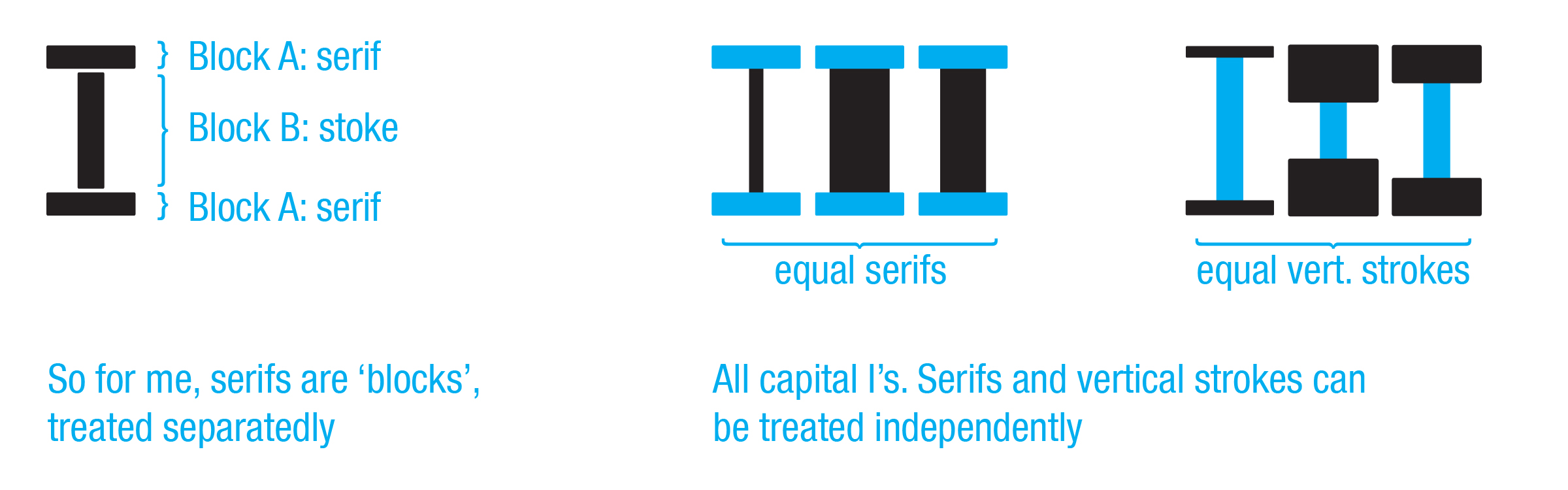
Figure 6: Serifs and vertical strokes can vary independently, and thus are independent vertical and horizontal blocks.
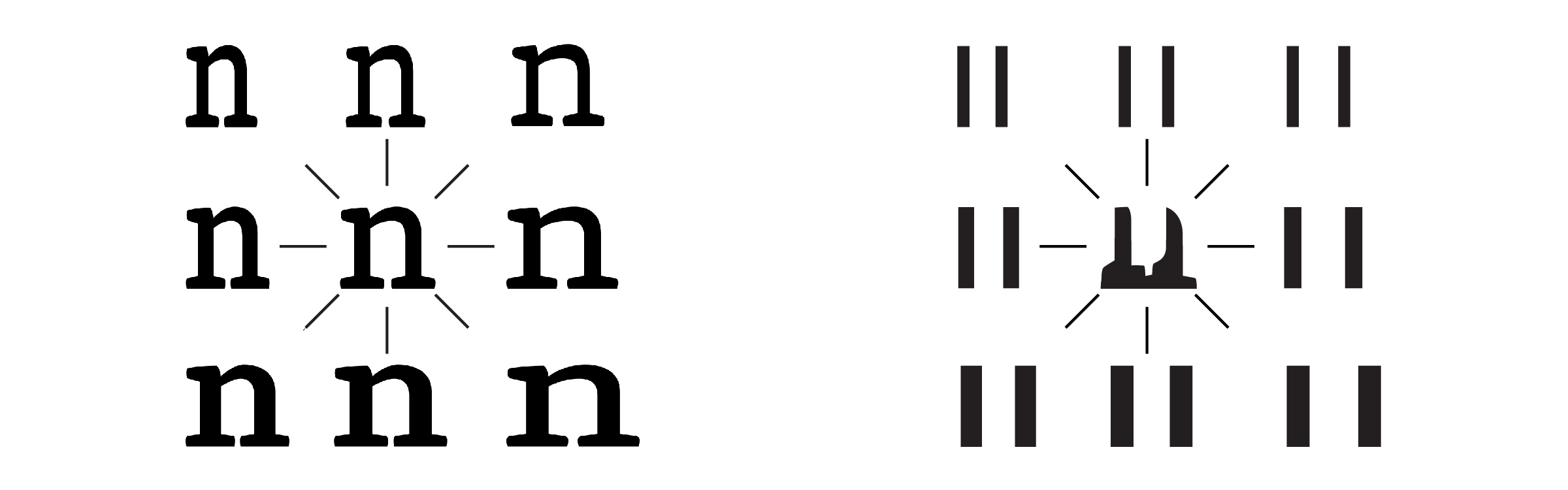
The rhythm is often defined as "the sequence of parallel strokes". Its occurence is one of the most fundamental decisions a type designer makes: how dark are the letters going to be (stroke thickness), and how wide are the letters going to be (spacing in-between the strokes: letter width and letter spacing)? Therefore, it is one of the most important elements of a Latin letter. Because it is a designers' choice, the rhythm varies within all typefaces (e.g. Georgia versus Verdana), as well as in the different fonts within a typeface (e.g. regular, bold, condensed, extended,…) [Figure 7]. But this definition is not accurate. The term "stroke" does not define a measurable item, as a program does not understand that concept. Additionally, a stroke can bend in several directions, such as happens in the shoulder, or a stroke can be drawn in overlap with other shapes [Figure 8]. Where does a stroke end in that case?
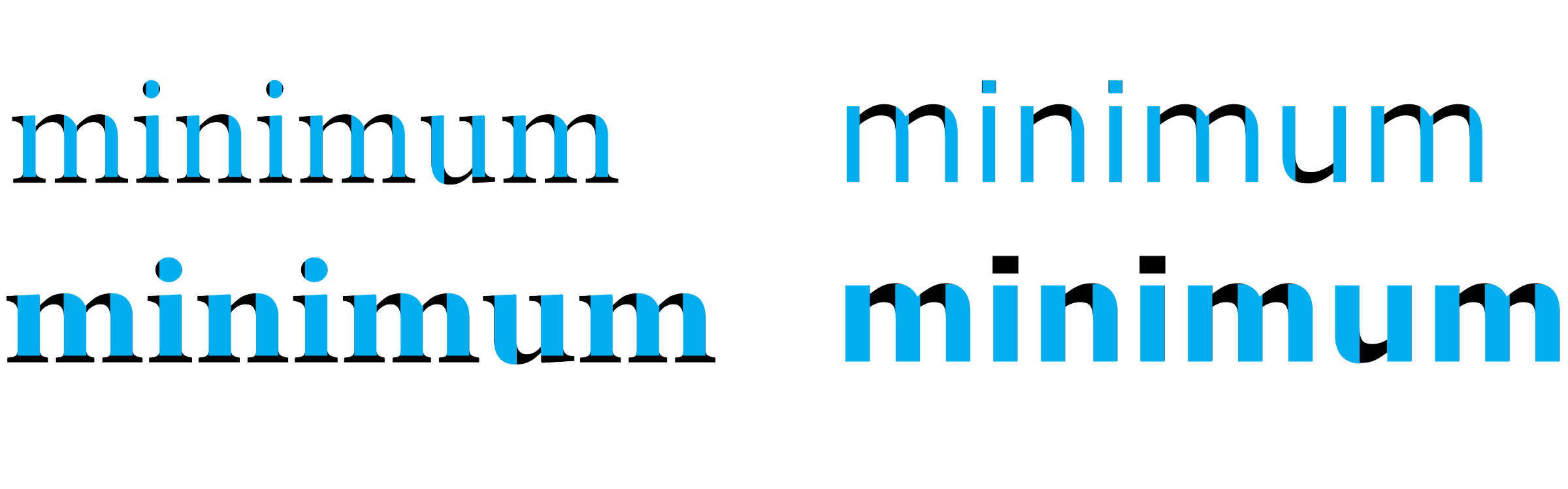
Figure 7: The typefaces Georgia regular/bold (left) and Verdana regular/bold (right). The position and length of the rhythm is indicated in blue and differs in each of them.
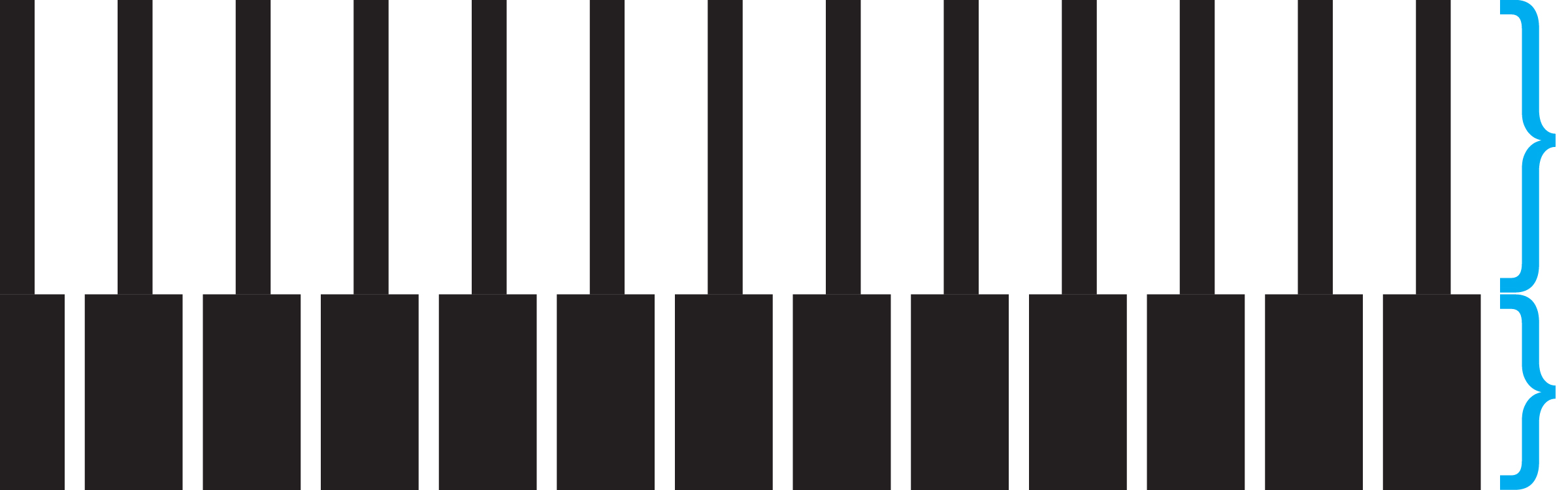
Figure 8: Nobody would say that the sequence of black and white is the same over the full height of the image. That is also valid for serifs in letters, which should not be looked at as part of the rhythm.
Therefore, Maarten Renckens defined the rhythm as "the repetition of the longest continuous concentration in the black mass of the letter". According to this definition, the rhythm should not always be straight, nor completely parallel, and stops at a white space or at a serif (as already illustrated in Figure 7). Treating strokes and serifs separately is not yet done in earlier definitions of the rhythm. But it solves the problems illustrated in Figure 8. This definition allows to determine the position of the rhythm in round shapes as well.
The Rhythm Influencer relies on three different engines to create variations on letters. The first engine performs an analysis on the black mass distribution within the letter [Figure 9]. The second engine derives the highest concentration of black mass, and uses that to position the rhythm (and thus scaling zones) [Figure 10]. The third engine uses the scaling zones to contextually scale the letters [Figure 11].
The third engine uses the scaling zones to scale different parts of the letterform independently. This way, the user can vary the darkness of the letters (stroke thickness) and the width of the letters (spacing in-between the strokes: letter width and letter spacing). The performance of all three engines can be reviewed separatedly within the plugin. Examples of outputs made by the plugin are illustrated in Figure 12.
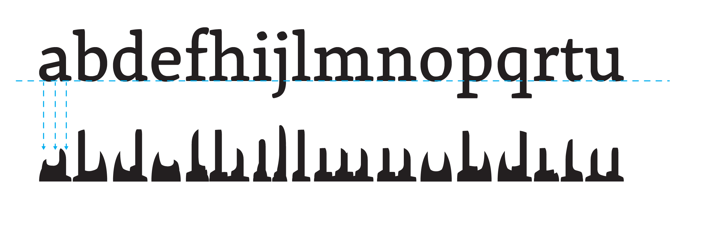
Figure 9: Analyses of the black mass according to the baseline.
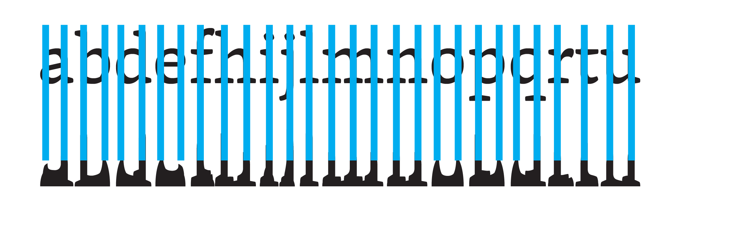
Figure 10: The higest peaks in the black mass distribution provide the position of the rhythm. With this definition, the rhythm can also be derived in rounded letterforms.
Figure 11: White and blue indicate scaling zones. Those zones are treated differently when adjusting letters in the Rhythm Influencer.
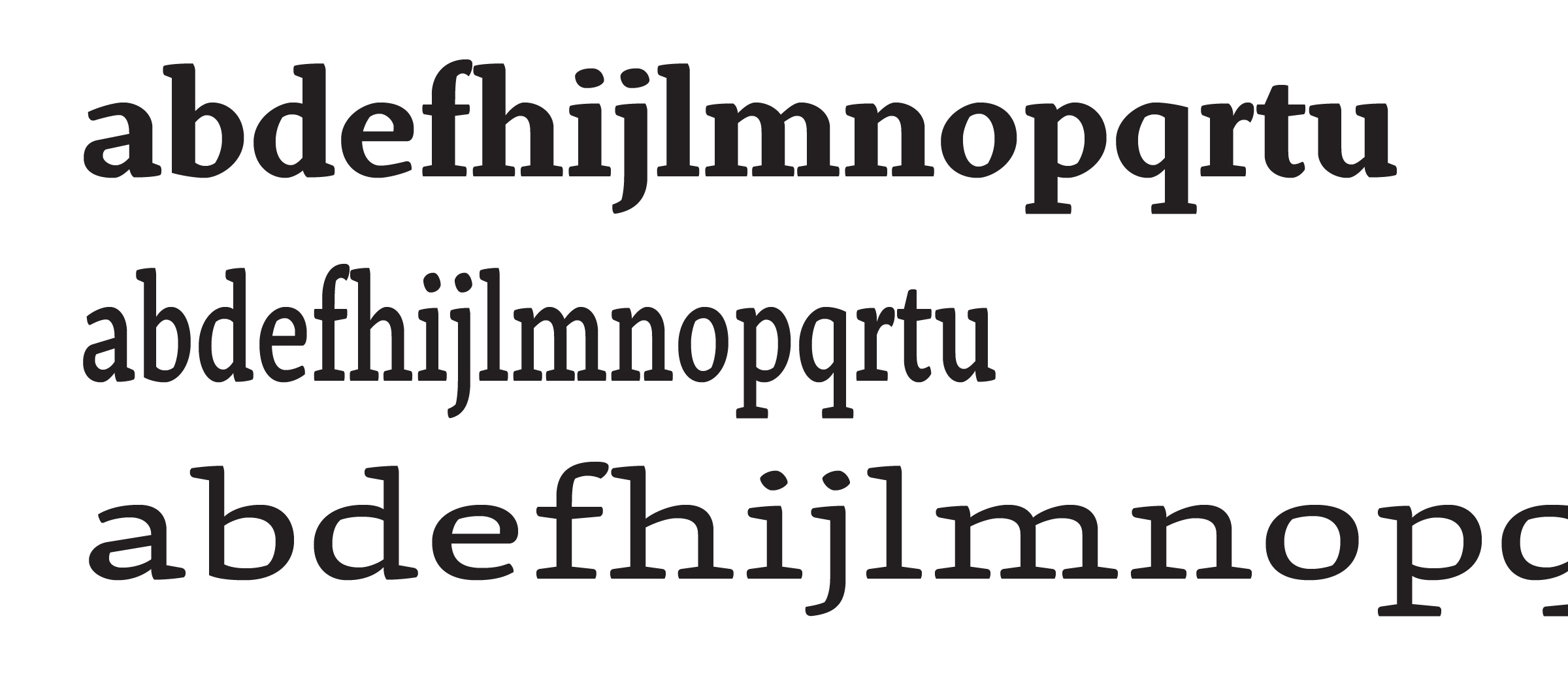
Figure 12: Output of the plugin, ready to be polished further by the designer.
No. There are quite a lot of cases wherein the plugin will not work, or not work completely as expected.
The Rhythm Influencer takes away the repetitive tasks, speeding up the development of letter variations. But as letters are complex drawings, the plugin cannot detect all details. Deformations can occur while creating some variations. Details which the designer would want to adjust are the contrast, roundings, spacing and/or inktraps. Additionally, scaling works well on letters with vertical strokes (f, h, i, j, l, m, n, r, t, u), and relatively well on round letters (b, c, d, e, o, p, q). But multi-level letters (B, a, g, Figure 13, left) and letters with diagonals (k, s, v, w, x, y, z) should not yet be scaled with the current version of the tool.
On top of this, when compared with the regular font, the different fonts can have different design options. So can a font with wider letter variation be designed with a lower shoulder, while font with narrower letter variations can be designed with a higher shoulder. These are design choices wich are open for the designer [Figure 13, right].
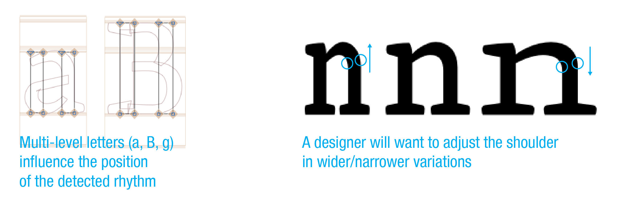
Figure 13: There always will remain some manual work. Left: complex letterforms can result in an incorrectly detected rhythm. Right: a designer will want to adjust details, such as the hight of the shoulder or the contrast, after the Rhythm Influencer did its work.
The Rhythm Influencer is an ongoing project. The program needs to become smarter over time. At this moment, a more refined black mass detection as well as serif detection are in development. An improved visualization of the rhythm will follow soon. Multiple master support and angles to work with italics are on the todo-list.
For more info, bug reports, suggestions or gifts to enable further development, contact maarten.renckens@artengar.com.
Thanks to people who provided feedback and/or assistance at one point or another: Benedikt Bramböck, Geertrui Storms, Georg Seifert, Gerry Leonidas, Jo De Baerdemaeker and Rainer Erich Scheichelbauer (Mekkablue).
Copyright 2020 Maarten Renckens. Concepts mentioned on this page are registered. Please use them always with a correct reference. Thanks for your respect.
The Rhythm Influencer was first presented to the public during TypeLab 2020 on 2020, June 19th. Since then it is available on Glyphs and Github.
